Reason for why you need responsive website
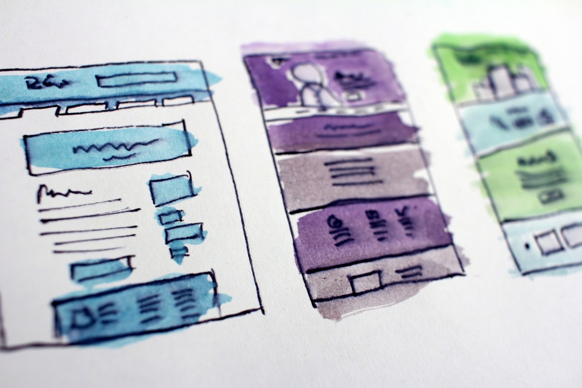
What is a responsive website?
Responsive website refers to a website which adjusts its design based on the screen size of the viewer's device. Responsive website are more accessible and better because they look awesome whether they are opened in mobile or tablet or desktop which makes it easier for visitors to interact and view your website.
Why responsive design?
Devices used to surf internet vary greatly by the size of screen. Data from Internet World Stats shows that there are now 4.53 billion people (about 58.8% of the world’s population) who have access to online web portals. Research firm BroadbandSearch reveals that web traffic that came from mobile users rose to 53% in 2019. How can you let your website look bad by not designing it properly for mobile users. Therefore, it is necessary to make your website responsive.
How can we create responsive design?
Some major differences in mobile and desktop screens are that mobile screens are small and vertical whereas desktops have wide screens. So, the layout should be selected such that it utilizes the screen area properly. Fonts size should also change as per device. It is useless to have very large text on a mobile device and smaller ones on desktop. Since, distance between eyes and screen vary largely. These are some of the key points to keep in your mind while designing websites.

Some Popular CSS Frameworks
CSS stands for Cascading Style Sheets. It is used for styling webpages.
Here are some popular CSS frameworks used to make websites beautiful
- Bootstrap CSS
- Tailwind CSS
- Bulma CSS
- Materialize
- UI kit


Comments
Post a Comment